

Element Properties
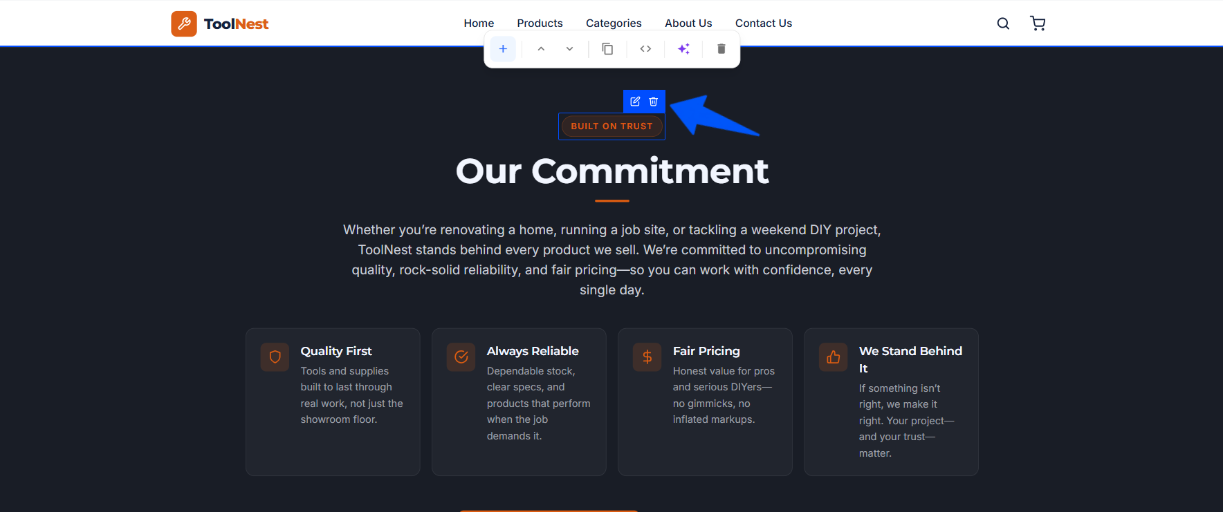
Every element on your page can be edited directly. Hover an element on the canvas and a small toolbar appears with two options: edit and delete.
- Edit (pencil). Open the element's Properties panel to customize it.
- Delete (trash). Remove the element from the page.
The Properties panel
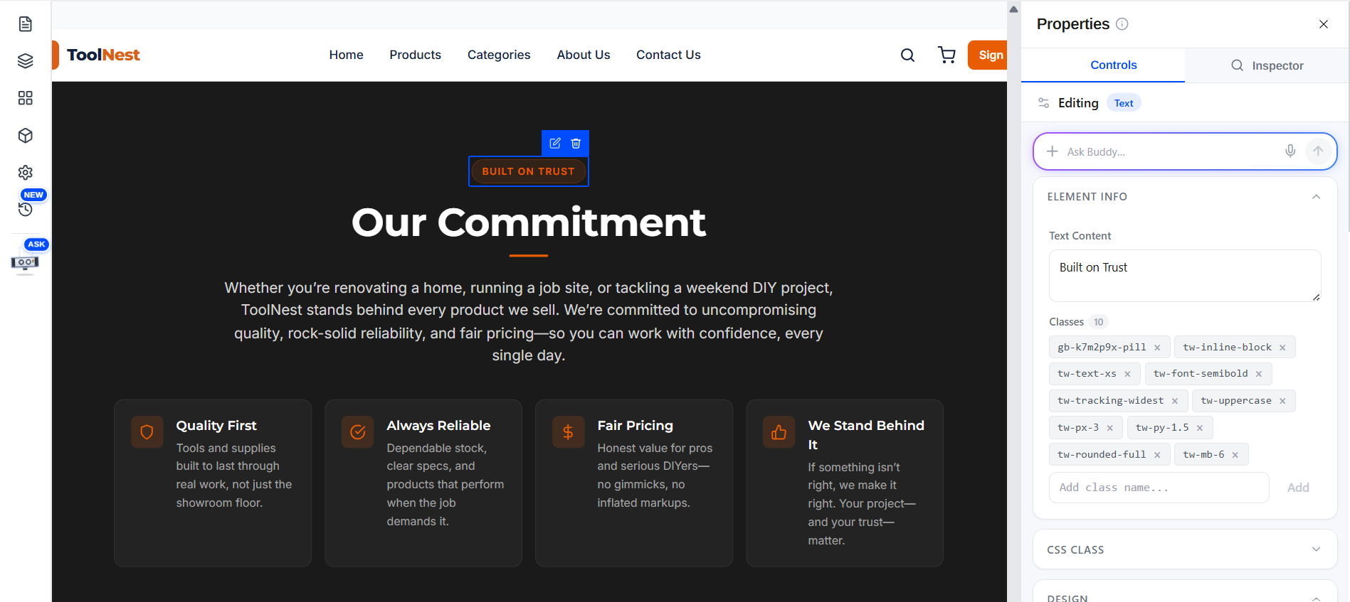
Click the edit (pencil) icon and the Properties panel opens on the right. It has two tabs, Controls and Inspector, an Ask Buddy bar, and a set of collapsible sections for everything about the element. A Reset button at the bottom returns the element to its defaults.
Edit with Buddy
At the top of the panel is an Ask Buddy… bar. Instead of adjusting the controls yourself, describe the change you want (for example make this heading bigger and center it) and Buddy updates the element for you.
Element Info
The Element Info section shows the element's Text Content and its CSS classes. Edit the text, and add or remove classes on the element.
CSS Class
The CSS Class section is where you work with the element's utility classes and the CSS rule behind them. Unlike the Design controls (which apply to the one element), a change here affects every element that uses the same class in the block.
- This element. A list of the classes currently applied to the selected
element, shown as chips (for example
.gb-k7m2p9x-pill,.tw-inline-block,.tw-text-xs,.tw-font-semibold,.tw-tracking-widest,.tw-uppercase,.tw-px-3,.tw-py-1.5,.tw-rounded-full,.tw-mb-6). The class you're editing is highlighted. - Or any class in this block. A dropdown that lists every class used anywhere in the current block (with a count), so you can pick and edit a class even if it isn't on the selected element.
- Rule editor. Below the dropdown, the selected class is shown as an editable
CSS rule — for example:
.gb-k7m2p9x-pill {
  background: rgba(232, 93, 4, 0.12);
  color: #E85D04;
  border: 1px solid rgba(232, 93, 4, …);
}
Edit the declarations directly to change how the class looks.
Design
The Design section styles the selected element visually. It's split into groups:
Typography
- Size. The font size in px (for example
16). - Weight. The font weight, from the dropdown (default
—). - Line Height. The line height (for example
1.5). - Spacing. Letter spacing in px (for example
0). - Text Color. The text color as a hex value (for example
#000000), with a color swatch/picker beside it. - Text Align. Left, center, right, or justify.
- Decoration. Underline, line-through, and so on (default
—). - Transform. Text casing — uppercase, lowercase, capitalize (default
—). - Style. Normal or Italic.
Background
- Fill Color. The element's background color (for example
transparent), with a color swatch/picker beside it.
Borders
- Radius. Corner radius in px (for example
0). - Width. Border thickness in px (for example
0). - Border Color. The border color as a hex value (for example
#E5E7EB), with a color swatch. - Style. The border line style — solid, dashed, dotted, and so on (default
—).
Shadow
- Box Shadow. A preset box-shadow (for example None) from the dropdown.
Layout
The Layout section controls how the element is placed and sized.
Display
- Display. Block, Flex, or Grid.
Spacing
- Padding. Inner spacing in px (for example
0). - Margin. Outer spacing in px (for example
0).
Size
- Width and Height. The element's dimensions (for example
auto). - Min Width and Max Width. Optional lower and upper bounds on width
(default
—).
Position
- Position. The CSS position (for example
—for default). - Z-Index. The stacking order (for example
auto).
Advanced
The Advanced section is for finer, element-specific control.
- Opacity. A slider from 0–100% (for example
100%). - Overflow. How overflowing content is handled (default
—). - Cursor. The mouse cursor shown over the element (default
—). - Visibility. Whether the element is visible or hidden (default
—). - Transition. A preset transition (for example None).
- Transform. A CSS transform (for example
rotate(5deg) scale(1.1)). - Custom CSS. A free-form CSS box (for example
color: #ffffff; font-size: 48px; letter-spacing: -0.02em;) that applies to this element only as an inline style.